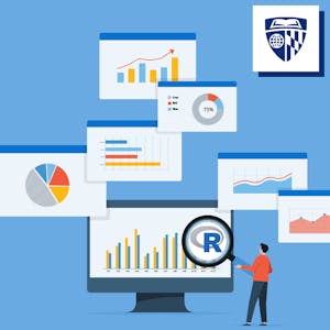
Data Visualization & Dashboarding with R is a comprehensive specialization offered by Johns Hopkins University. Through five engaging courses, learners will gain the ability to visualize data using R, create static and interactive visualizations, and publish them on the web. The program is designed to equip learners with the skills to provide valuable insights to various audiences.
By the end of the specialization, learners will have the proficiency to manipulate data, create reports using R Markdown, use ggplot2 for a variety of visualizations, expand their inventory of data visualization options, create interactive visualizations using Shiny, and apply their skills to a unique project using publicly available data.
Certificate Available ✔
Get Started / More Info
This specialization consists of five engaging courses. Learners will start with an introduction to data visualization in R, followed by learning to use ggplot2 for various visualizations, expanding their visualization options, creating interactive visualizations with Shiny, and concluding with a capstone project applying their skills to real-world data.
Data visualization is a critical skill for anyone working with quantitative data. This course is designed for learners with little or no experience with R, providing an introduction to importing and manipulating data using tools from the tidyverse package.
Building on the foundational knowledge from the first course, learners will focus on using ggplot2 to create a variety of visualizations and polish them using tools within ggplot and vector graphics editing software.
Learners will expand their inventory of data visualization options, drawing on additional packages to make more variants of traditional figures and delve into spatial data. The course will conclude with creating interactive and animated figures.
With a strong background in visualization using ggplot2, learners will create interactive visualizations using Shiny and combine different kinds of figures made in R into interactive dashboards.
Learners will apply their skills to a unique project, using publicly available data to tell a compelling story using the data visualization toolkit assembled in the previous courses.
Learn to create path models using Smartpls in this 1-hour project-based course. Interpret and run models for different groups effectively.
Demand Planning in RStudio: Create Demand Forecast is a 2-hour project-based course for Supply Chain and Operations Analysts, focusing on demand data analysis, forecasting,...
Mastering Data Analysis with Pandas: Learning Path Part 3 equips learners with advanced skills in DataFrame operations, custom function application, and manipulations....
Tools for Data Science is a comprehensive course that teaches the essential tools and skills required for a successful career in Data Science.